
When Average is Anything But…
We spend a lot of time focused on making sure you can achieve your financial goals. For most of you, the most significant goal is being able to retire (or being able to continue your retirement). “Retirement” means something very different to each of you. Some of you see yourselves traveling the world and living a life of leisure. Others plan to continue working but with a much more flexible schedule. No matter how you define it, making sure you can do it on your terms is important.
Years ago, people used to forecast retirement (and other) outcomes using a very simplistic approach. They would determine an estimate of the average return a portfolio would produce. Then, they used that average return to forecast outcomes by assuming that the portfolio would produce the average return each and every year.
Let’s assume that someone retires at 65 and we are planning through age 94. Let’s also assume that they start retirement with a $1 million portfolio and are going to take $50,000 each year (we will not index for inflation). The early analysis would look something like this (there is no need to pore over every number, suffice to say that every year, the ending value increases):

That approach would often paint a good picture; albeit one that may not have been too realistic since the odds of getting the average return in any one year, much less every year, are fairly slim. So, savvy analysts started using actual historical returns to try to paint a more realistic picture. Using actual annual returns, the above analysis might be adjusted as follows (again, no need to pore over every number – we highlight a few key differences below the chart):
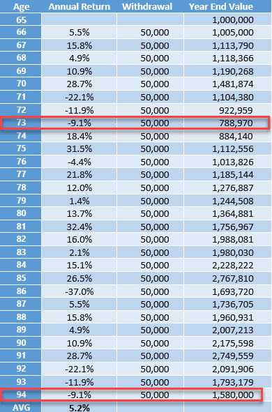
While the average return is still the same, there are some key differences. First, take a look at values at age 73. In the first analysis above, the portfolio was worth $1.02 million whereas in this “more realistic” analysis, the value drops to under $800k. A 20% swing is certainly not trivial! Perhaps a more important issue is the terminal value at age 94. In the latter analysis, it looks much better - $1.58 million vs. $1.15 million.
Either way, both approaches suggest that it will be a successful retirement, right? Not so quick…
Even savvier analysts began asking a very simple question. What happens if the sequence of returns is changed? In other words, instead of things happening as shown above, we have the same returns but in reverse? The average would still be the same, but how would it impact the forecast?
Let’s take a look (again, we’ll highlight some key points following the chart):

That’s not too pretty! Due to a few very rough years in the beginning, this retirement appears doomed. In this case, money runs out before the end of the forecast period.
To summarize the three scenarios:
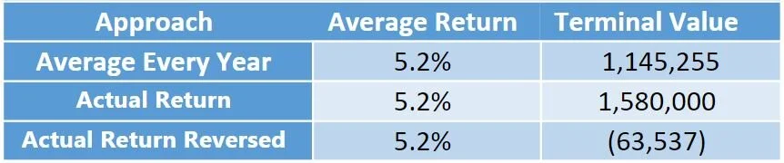
Despite each scenario having the same average return, the outcomes vary considerably. So, forecasting based solely on an average return clearly does not provide the type of robust analysis that is required. The sad fact is that being forced to take money from a portfolio that has suffered significant declines can create challenges. While those challenges can be overcome, the earlier those declines occur, the more difficult it is to recover.
There are obviously many more scenarios than the ones we have outlined today. Next month, we’ll dive into how we use Monte Carlo analysis in an effort to provide a more robust plan for you.
Until then, enjoy what’s left of your summer!